Currently calendars, reminders and notes are separate applications on the iPhone. This causes inconvenience for users. I am trying to streamline the experience by putting them all in one application. I conducted User Interviews, sent out a Survey, and built a Persona with a User Journey and Empathy map in order to gather information for this project. From my findings, I found that half my users are in favor for a calendar application redesign for the iPhone as well as all my user participants prefer a phone application.
Comparative Analysis
I did a comparative analysis between Apple calendars, Google calendars and Microsoft Outlook. Apple calendars is available on desktop phone and tablet. It features calendar Reminders and notes all of which are separate applications. They do not require an additional sign in.
Google calendar requires an additional sign in. It does not have notes and reminders and requires a monthly subscription for their desktop application.
Microsoft Outlook is available through desktop tablet and phone. They require an additional sign on an email address that has .Outlook. The calendar and to do list applications are on separate screens.
All three applications have in common are calendar reminders and notes are on separate applications. Microsoft Outlook and Google calendar require an additional sign in where privacy might be a concern. Not all the applications have a note in a reminder feature.
User Interviews
The goal of user interviews is to determine electronic calendar usage among my users as well as the habits of using those calendars. I want to discover what their age demographic and preferred calendar of choice as well as if participants desire additional functions.
I interviewed nine people in total and of the nine people six of them preferred Google calendars one preferred the Apple calendar and one person used Microsoft Outlook. My users preferred Google calendar for their simplicity and shareability. Only seven of my participants alluded to the problem of not having all of their calendar items all in one place. Only one person outright said that they wish that everything was together in one place. I also asked the question where did they use their calendar most in order to decide between creating a dashboard or a mobile app. All of my users user calendars on their primally phones. The constant theme between all my users is that technology doesn’t fail them but it is human error (forgot to check the app) that causes them to miss appointments. Only one user was not satisfied with Microsoft Outlook because of its constant crashes on their mobile device. They are forced to use Microsoft Outlook due to the restrictions of the organization that they are in. I discovered that tracking long-term goals is not necessary feature that my participants are concerned about. Either they don’t have long-term goals or it’s not necessary. I think I might make that feature optional instead of required.
Survey
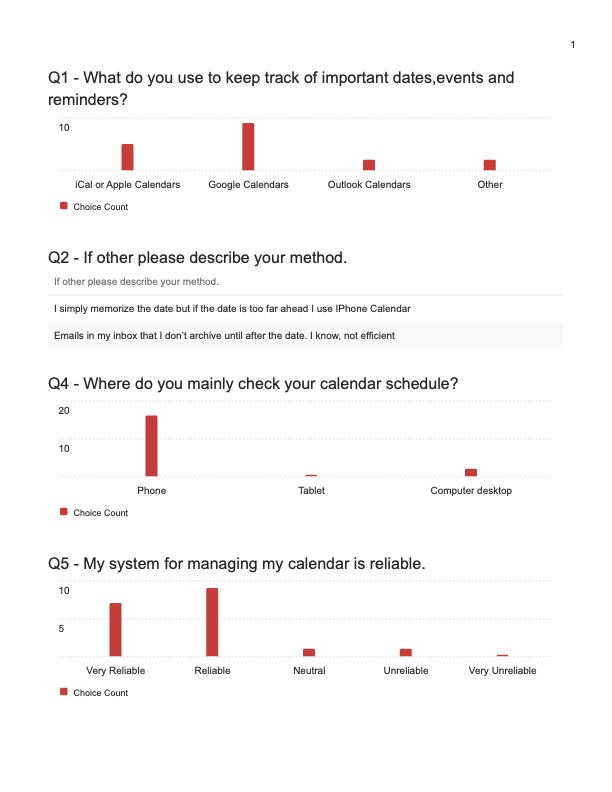
My survey participants were the general public agnostic to age or race. I surveyed 18 people and these are my results. In summary, my survey participants preferred Google calendars but with Apple calendars (iCal) as a close second. My survey participants prefer to check their calendars on their phones over a desktop and tablet. Overall they find their system reliable and use notes, reminders and tasks to keep track of their appointments.
The goal of the survey is to reach a wider audience than my usability interviews. It also attempts to summarize the data into objective measurable as opposed to personal experiences and anecdotes.
From the data that I gathered, nine of my survey participants like using Google calendars. This is followed by five survey participants favoring Apple calendars (iCal). Lastly, two survey participants using Outlook calendars and two with other methods. This is good because I am innovating on Apple calendars (iCal).
My survey participants check their calendars on their phone with sixteen survey participants followed by two survey participants checking their calendar on their desktop. For a while I was debating between making a desktop app or a mobile phone app. My survey participants prefer having a mobile version of their calendar.
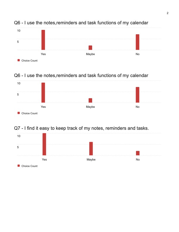
Overall my survey participants found that their method is reliable or very reliable. The one survey participant that answered their method was unreliable does not currently use a calendar. Ten of my survey participants use notes, reminders and tasks. They find it easy to keep track of their notes, reminders and tasks.
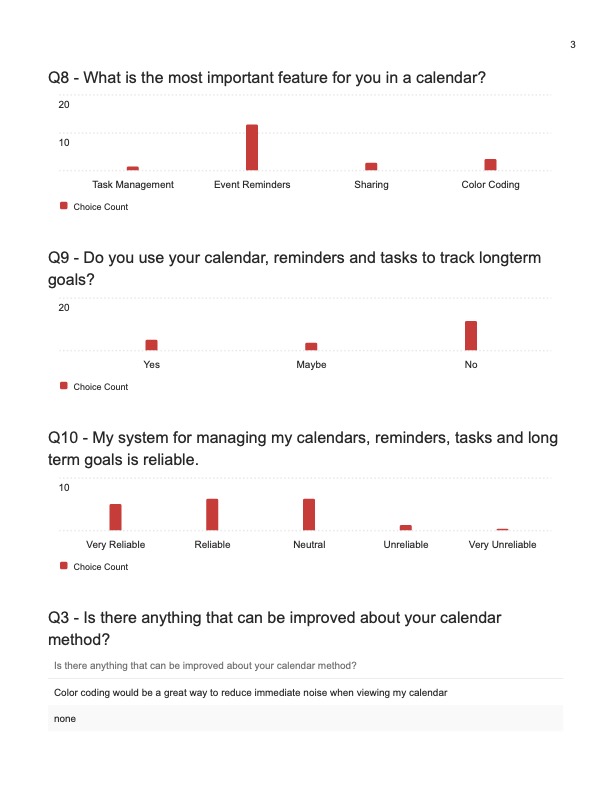
The question that surprised me the most was “What is the most important feature for your calendar?”. My survey participants wanted event reminders. I thought sharing would have been the most important feature but only two survey participants said so. This was surprising because sharing is a key feature in Google calendars.
My survey participants generally do not use their calendar apps to plan their long-term goals.
Lastly, I asked if there is anything that can be improved in the method and one striking comment I got was “I wish Google calendars was more like Apple calendars in terms of layout.” This makes me want to design closer to Apple Calendars (iCal). Other than that my survey participants cannot think of anything that can be improved upon.
User Persona and User Journey
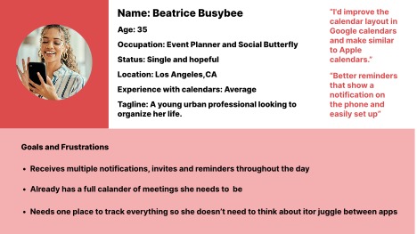
From my User interviews and Survey Data created a persona of our user in order to better focus on what we are designing for. So imagine you are Beatrice Busybee event planner extraordinaire and you are bombarded with notifications and reminders all the time. Wouldn’t it be great if it the experience of your calendar was seamless?
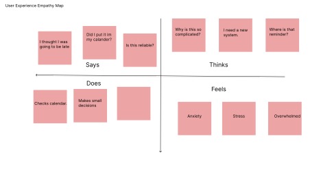
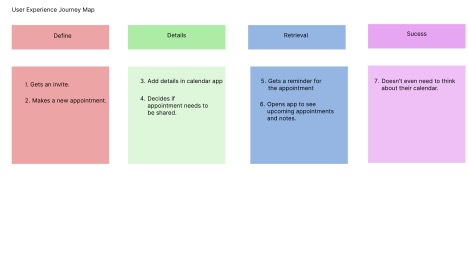
The User Journey Map and User Empathy Map reenforce the troubles Beatrice faces while using her calendar, notes and reminder setup.
How Might We
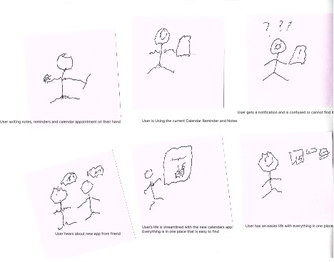
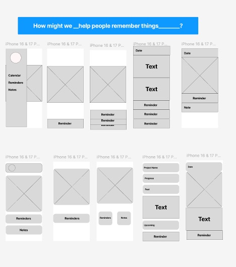
From there we asked our users How Might We Questions in order to gain a better understanding of our intended user which leads us to the development of my storyboards. I also changed my prompt to “ How Might We help our users remember things”.
Task Flows
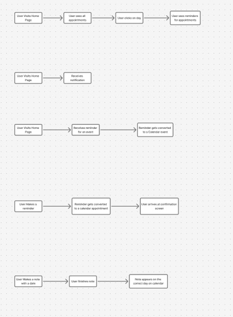
From my storyboards I brainstormed tasks that I want my users to achieve and formed task flows.
I want my user to be able to create a calendar appointment, reminder and note within the app as well as for the newly created item to be accessible directly in the app.
Screen Design
For my first try at screen design I used a simple screen design used from the Figma exercises. That is where my inspiration came from. From left to right you have the main menu followed by the main landing page, then a stack a reminders with the calendar followed by a specific day where you can see your appointments and reminders on that day. Finally a screen with a calendar date was a reminder and note.
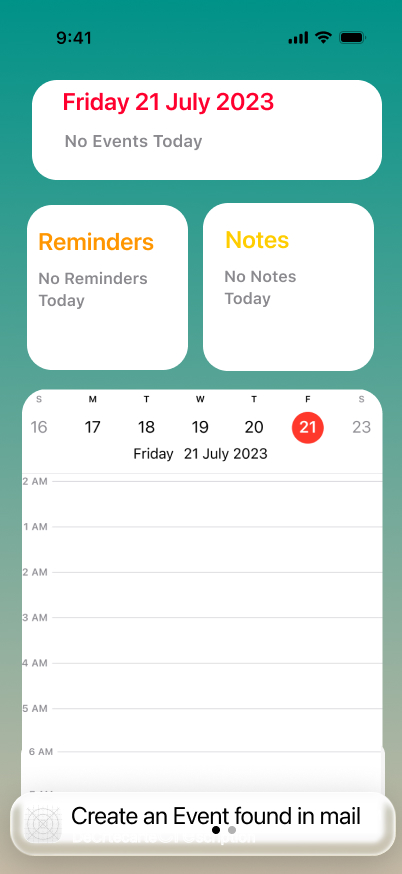
For the second attempt I drew inspiration from the widget screen of the iPhone. I used a rounded corners to make it less formal and less rigid. From left to right you have the main menu screen, followed by the calendar and reminder screen. Then a calendar, reminder and note screen. For the fourth screen I was testing out whether to put a goal oriented screen for specific projects and all tags for that specific project will show up on one screen. Lastly I have a simple one date screen that displays everything for that day.
Paper Prototype
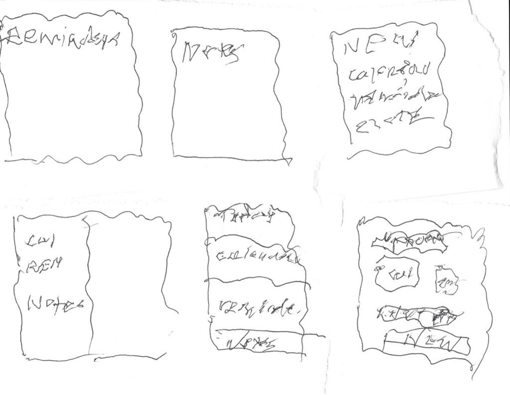
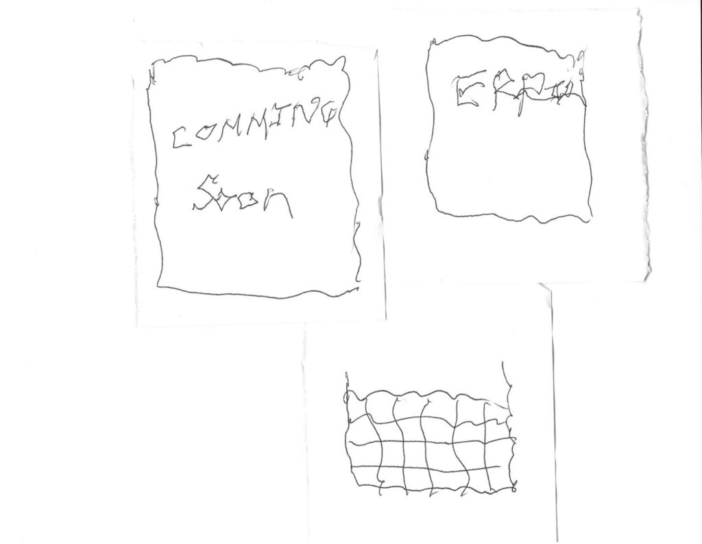
:My app is designed for everybody of all ages. I tested my paper prototype on four participants. The biggest complaint was that of my handwriting which I cannot help. Overall, my users were able to execute the core functions of the app on the paper prototype. My number one stumbling block was why are there two menu panels. This problem I will solve by eliminating one but I have to think about it.
I am constrained by the libraries that were avalible to me at the time as well as the due date for this project. As of this moment there are no next steps planned.